Designing for Brown and RISD's Literary and Visual Arts Magazine for the
Asian/Asian-American, & Pacific Islander community
View the VISIONS website
Overview
VISIONS Magazine is Brown and RISD’s Literary and Visual Arts Magazine that highlights the voices of our Asian, Asian American, and Pacific Islander creators. The website I designed serves to stitch the individual expressions of these unique identities into a cohesive communal experience.
I completely redesigned the website and its features to improve user's online experience. Currently, I keep the website up to date with the latest events, magazine releases, and any special features such as artist interviews.
Date:
Sep ‘21 - Present
Role:
Web Editor
Tools:
Wix Editor
Problems
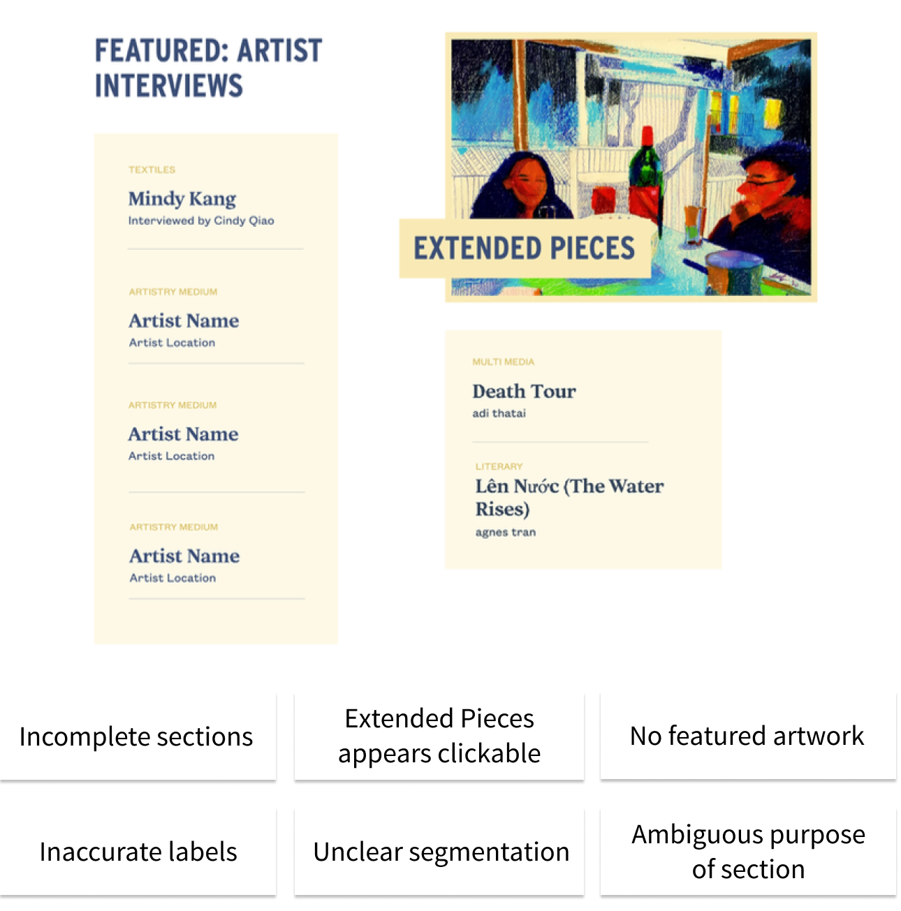
1. The existing website had been edited by many people, and the design, fonts used, and color palette was inconsistent across the pages. Many of the pages were incomplete, and there was no complete archive to store previous artist interviews and extended pieces.
2. It was difficult to navigate the site, and certain features were buried in other hidden pages meaning they were going unnoticed. There is a large number of pages, but nesting them leads to lower engagement since they cannot be easily accessed by casual viewers.
Previous VISIONS Website
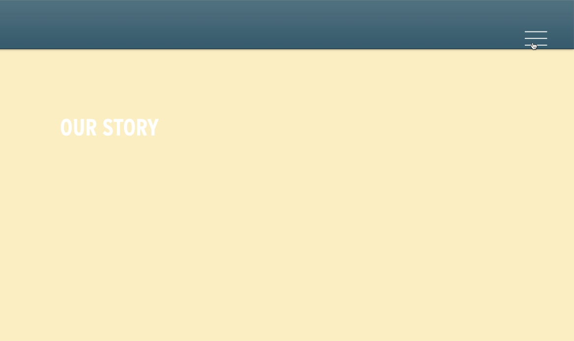
Our Story Page

Multimedia Page
Target Users
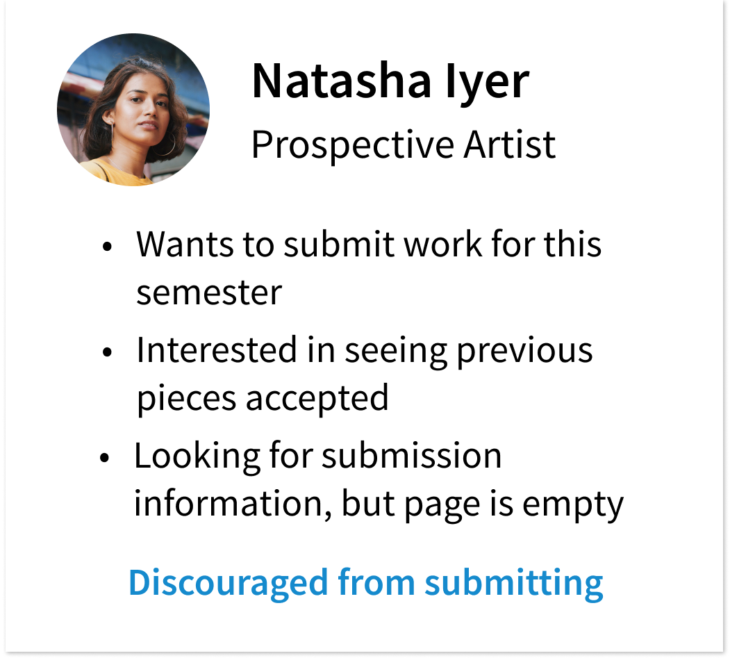
After considering who might be using the VISIONS website as well as discussing what viewers might want to see, there was a clear need for a complete redesign of both the organization and appearance of the website, as well as thorough updating of each page.
Design Iterations
I began by solving the organization problem. I sorted through what features needed to be shown and began categorizing them.
I decided the hamburger sidebar was not suitable, and was working to balance simplicity with page accessibility. I wanted to ensure features were quickly visible without much effort on the viewer’s part.
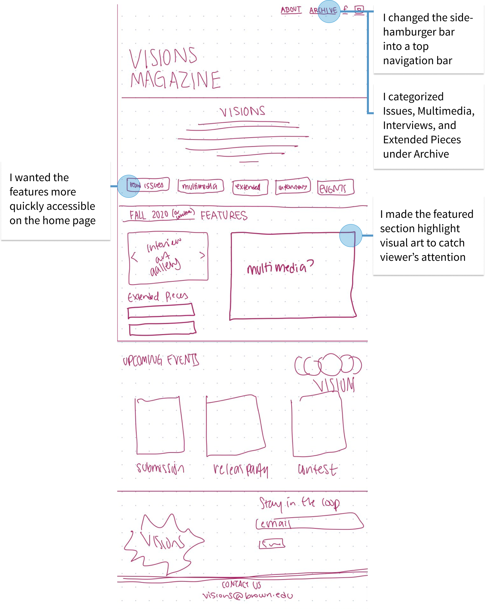
Early Sketches
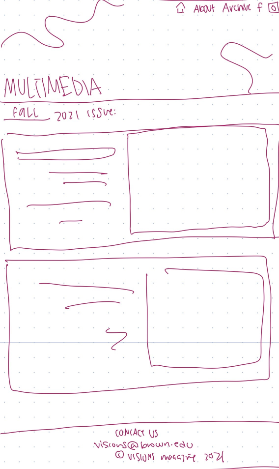
Multimedia Page Sketch
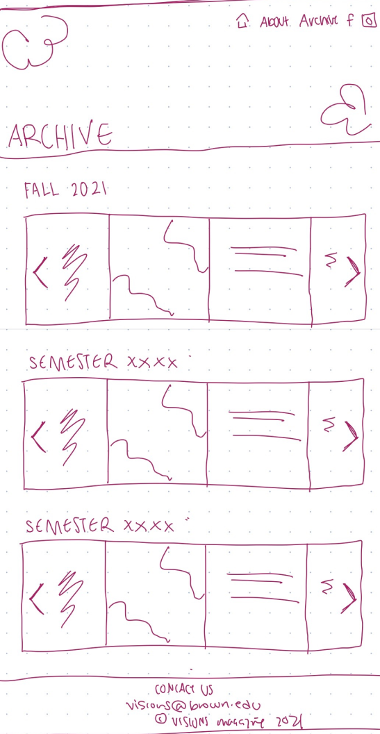
Archive Page Sketch
There were a few issues with my initial design iteration that I addressed in my final design. I felt Archive did not adequately describe what it stored and viewers would be unable to immediately know what pages were featured on the website. Additionally, within the Archive page itself, there was too much nesting within each page. It required too much effort on the part of a casual viewer to look at the actual pieces, which is ultimately what the website is meant to highlight.
Final Design: Increasing Engagement
The final website fulfilled the purpose of the website: to draw in viewers, potential club members, and to inspire artists to submit new work. I chose a few notable design choices to highlight below.
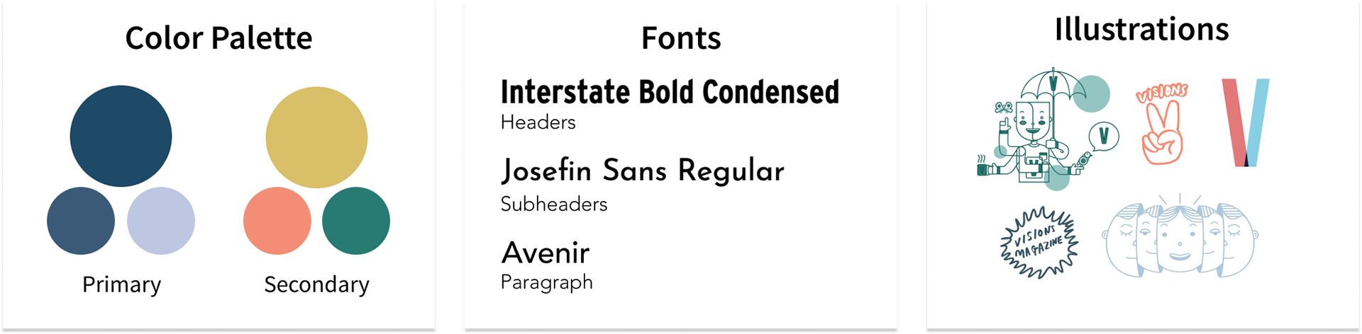
Style Guide
My design to reflect a celebration of the extensive range of AAPIA experiences. I kept my colors consistent with the art piece highlighted on the main page, but used a range of colors to make the website colorful and playful. I wanted viewers to experience a sense of the emotions shared by student artists and authors in the website itself.
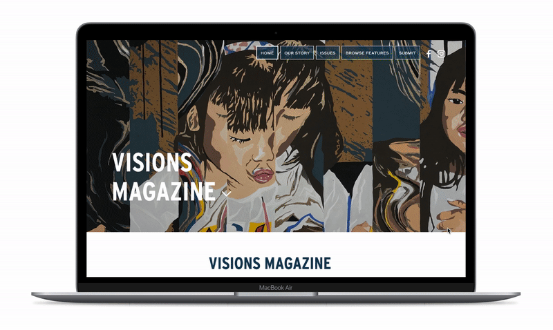
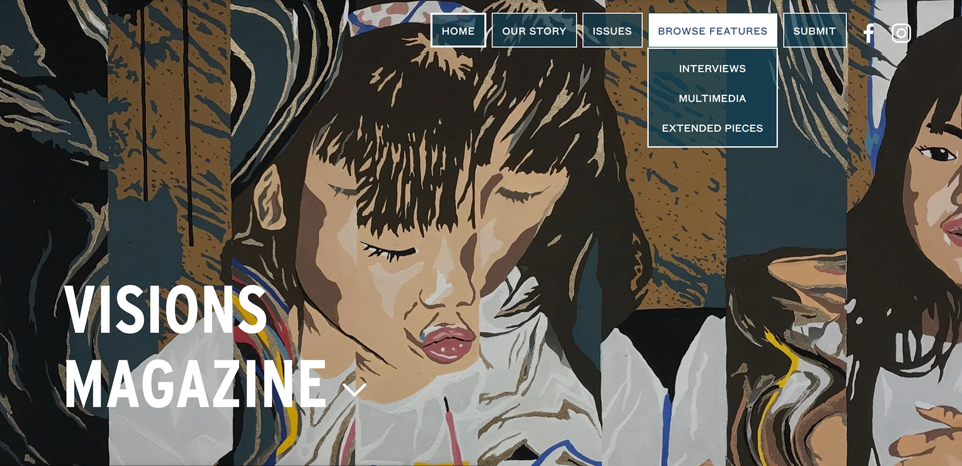
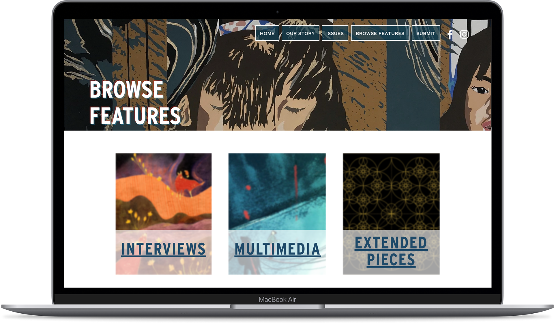
Navigation Bar
Most viewers are either casually browsing, or looking for a single specific page and are not motivated to explore the contents of the website.
Because of this, I decided to change the hamburger menu to an overhead navigation bar to ensure that the features on the website were in immediate view of the user. I took away the intermediate step of clicking the hamburger bar to see what else is offered on the website.
The top bar is more likely to catch a viewer’s eye and prompt them to click and see what is in those pages. This change better engages the viewer with the website.
Current Navigation Bar
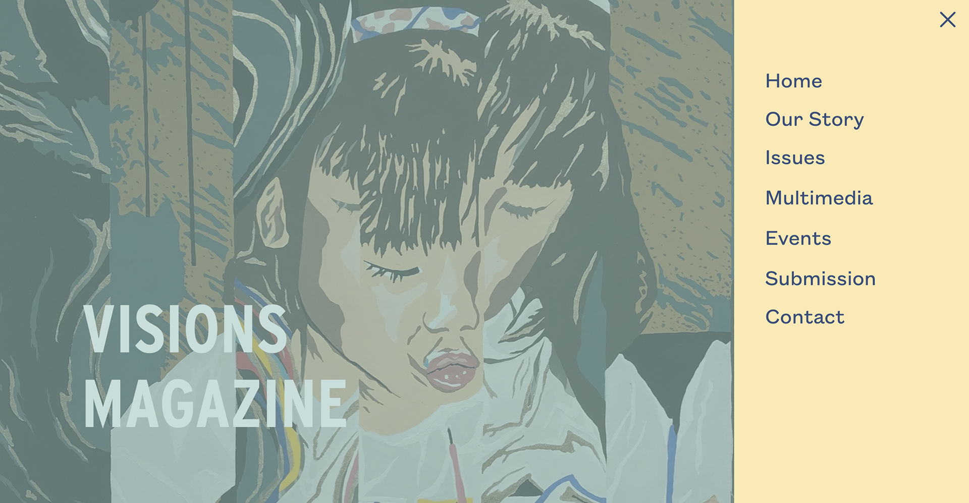
Previous Hamburger Menu
Featured Artwork
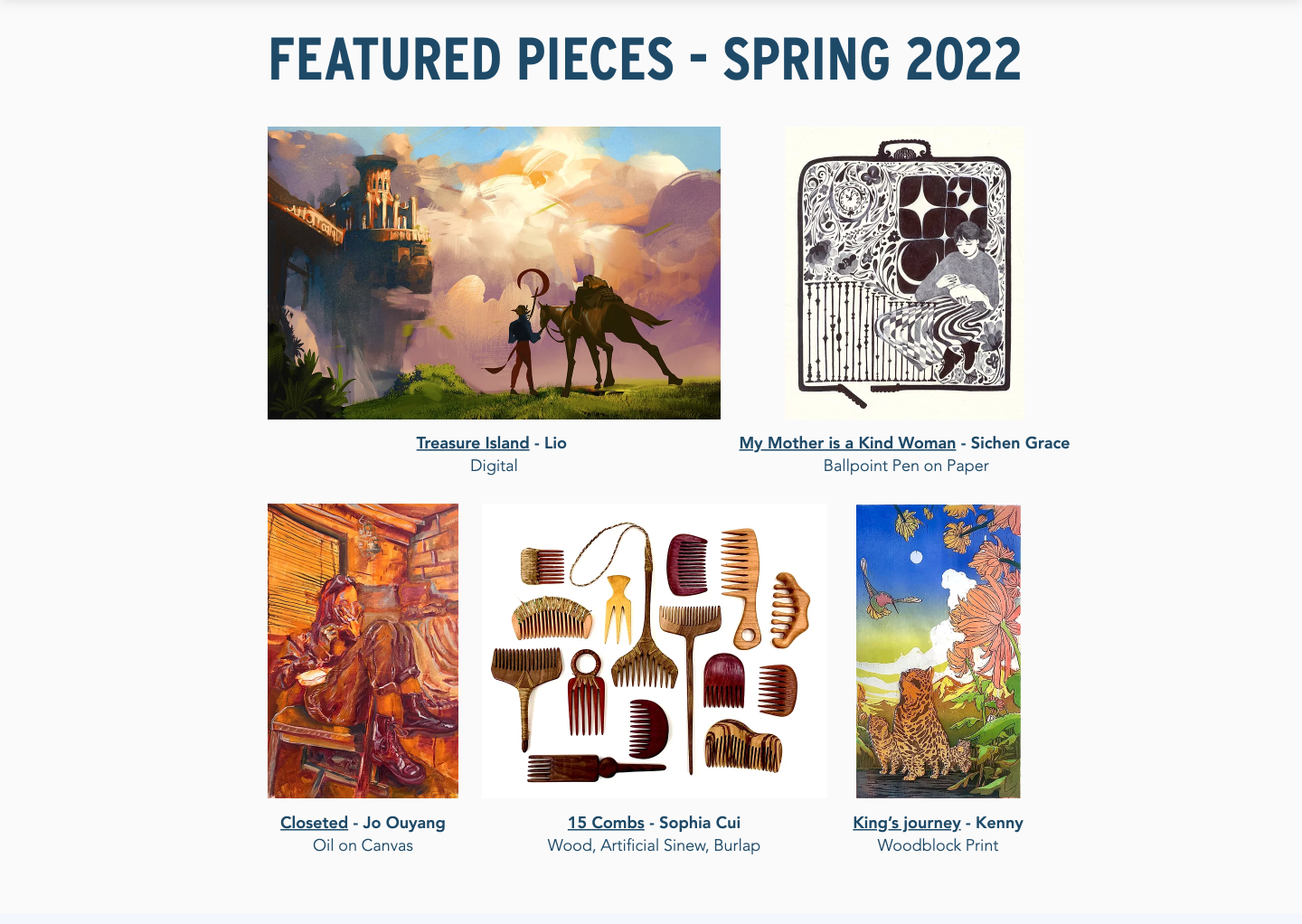
The previous website's "Featured Pieces" section was unorganized and confusing and did not provide immediate visuals to engage the viewer.
I chose to display featured art pieces as well as extended pieces to bring the viewers closer to the artists and their pieces. I used a gallery style with colorful pieces to match the color palette while quickly drawing interest to the magazine and talent of the artists.
Other Changes
I categorized 'Issues,' 'Multimedia,' 'Interviews,' and 'Extended Pieces' under 'Browse Features' so every archived page could be easily found while better organizing the website. I decided to not to organize archived pages by year, so that a single click would bring you in direct contact with the artists and their pieces.
I also added buttons that would quickly take you to other pages on most pages so that a viewer is even more likely to further explore the website with minimal effort and thought.
Finally, I filled in empty pages and made every page's color palette and fonts consistent.

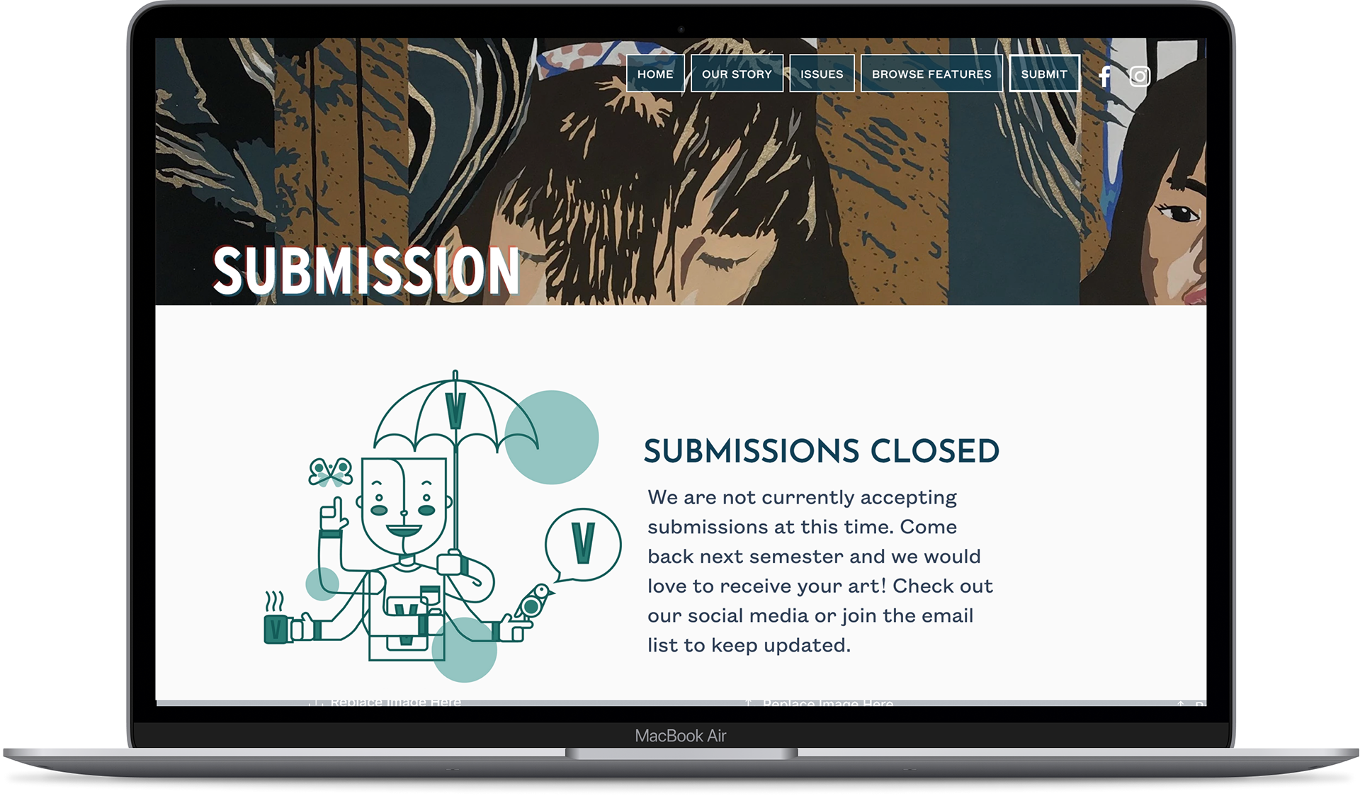
Submissions Page
Our Story Page
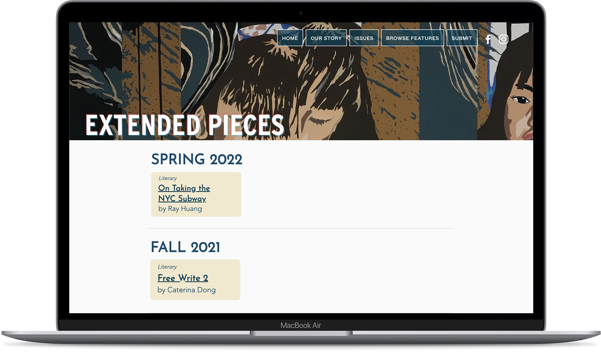
Extended Pieces Page
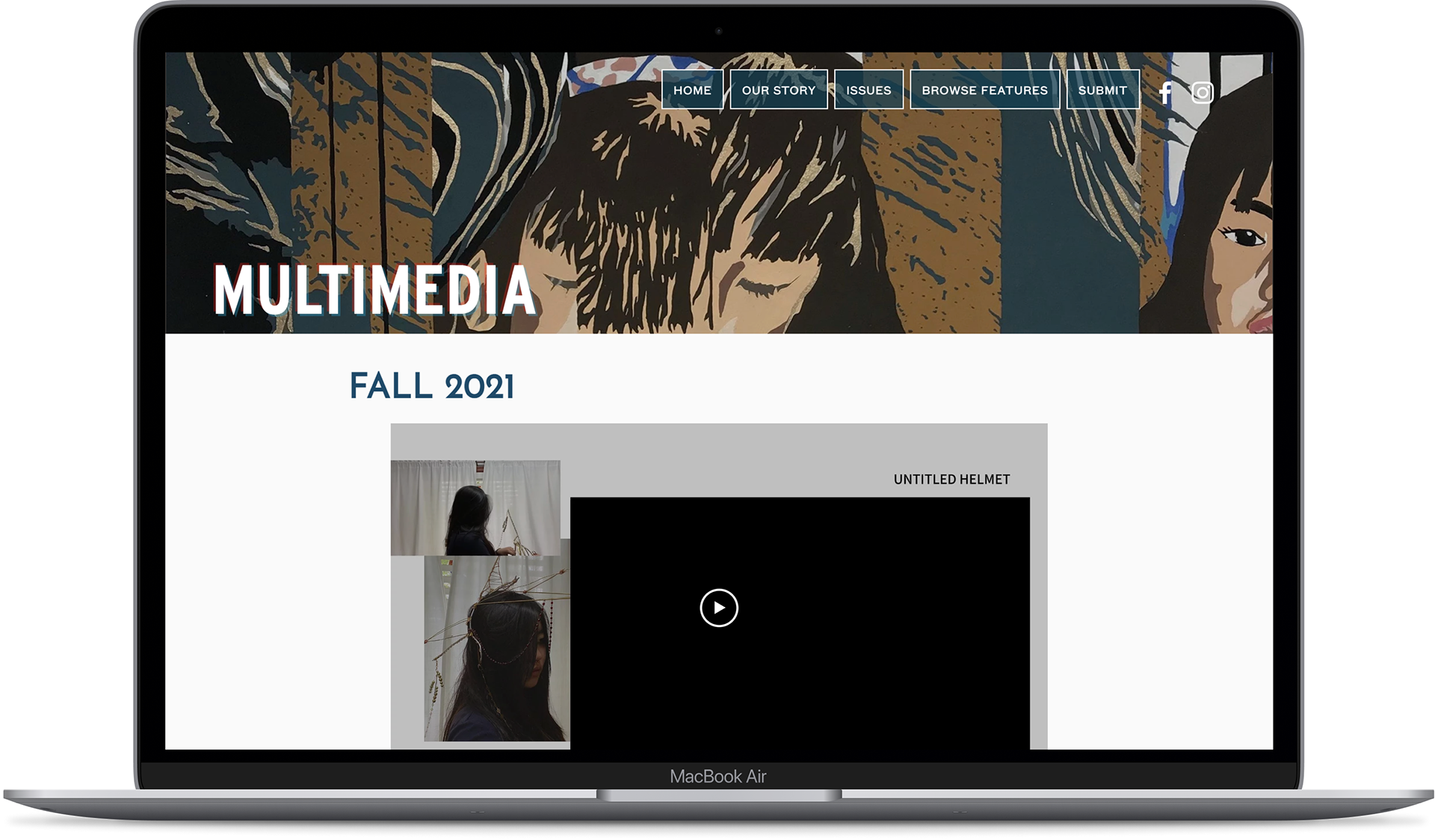
Multimedia Page
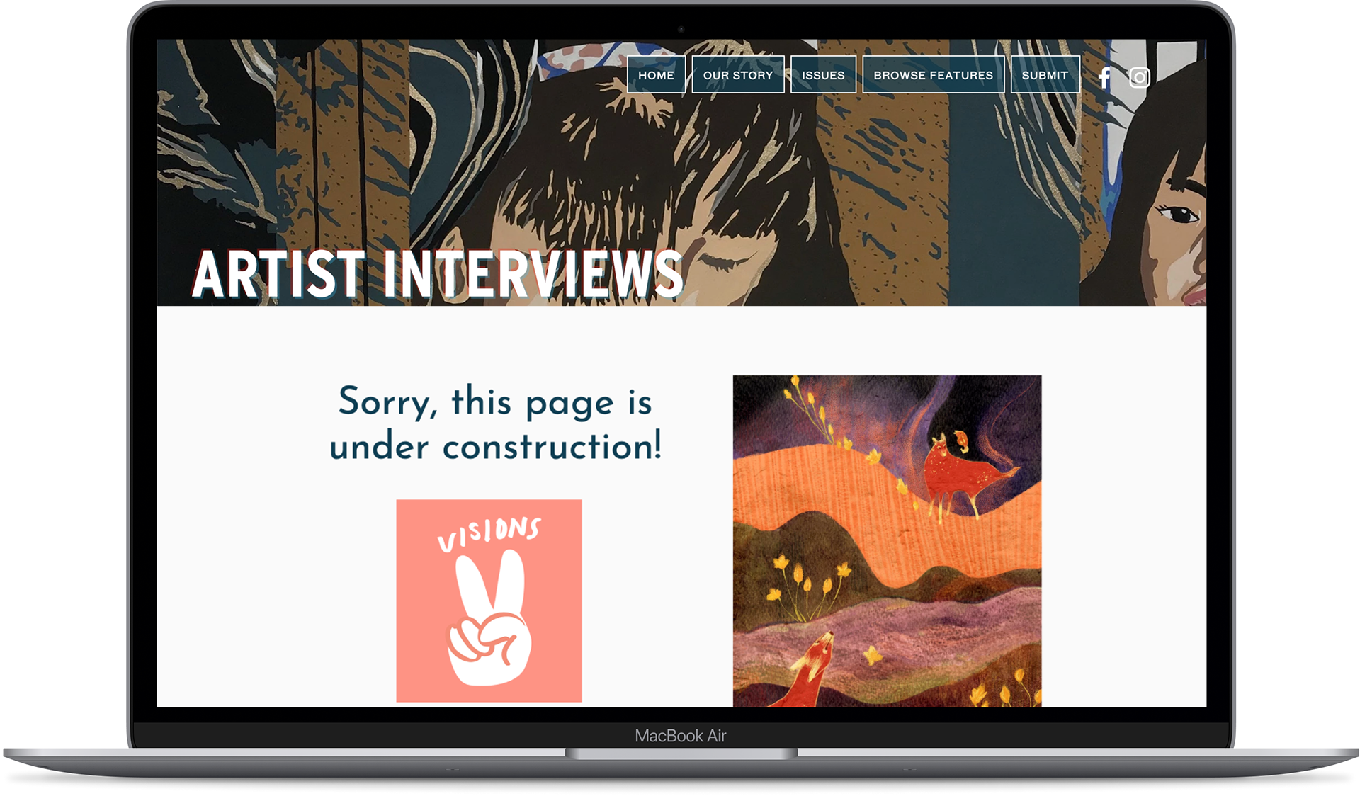
Artist Interviews Page
Next Steps
○ Encourage more multimedia submissions by having shorter multimedia submission cycles.
○ Updating the artist interviews page.
○ Improve the design of the extended pieces page to best display literary work.
○ Make the website mobile friendly.
Reflections
As someone who is half-Chinese, being able to work on VISIONS and being a part of the process which publishes bi-annual magazines full of a diverse range of stories and art from the entire diaspora of the AAPIA is something I am incredibly passionate about. VISIONS pushes the boundaries of what AAPIA art can be, and I am grateful for the opportunity to design a website which contributes to showcasing a small portion of what makes an AAPIA experience.