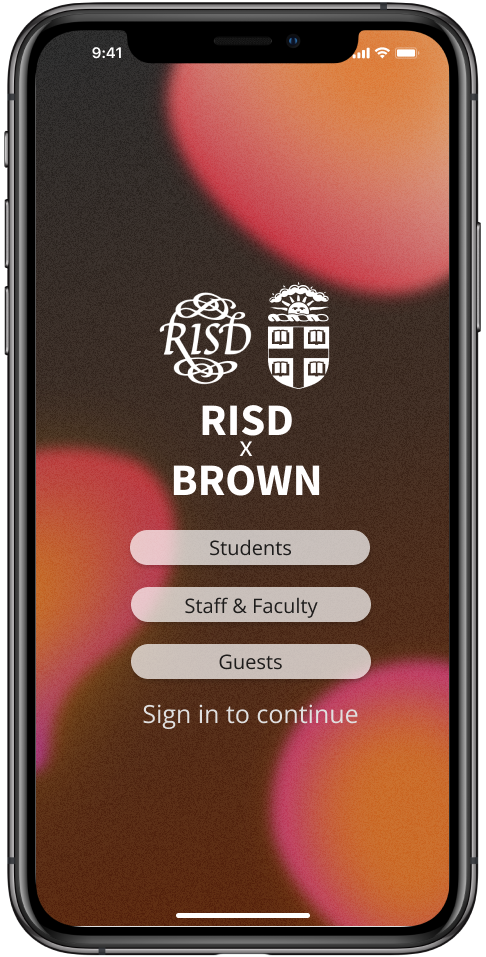
A complete redesign combining the RISD and Brown University mobile apps into one cross-campus university app

Overview
In this project, I redesigned the RISD and Brown university apps over the course of 4 weeks.
Areas of design included the general organization, home screen, and transportation features. The transportation features required integrating Brown Shuttle, Brown OnCall, and RISD Rides services.
I conducted user surveys and interviews across both campuses while researching alternative university apps before developing my design. I also conducted validation interviews to further hone my designs to fit the needs of students.
Date:
Feb ‘22 - Mar ‘22
Role:
UX researcher and designer
Tools:
Figma
Problems
1. Every university needs an app for students to access a broad range of information, from personal information, to available resources and facilities.
How do you display all that information?
How do you decide what is important for each student?
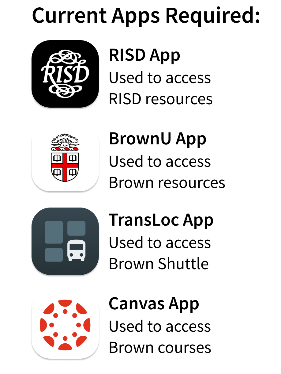
2. RISD, Brown, and Dual Degree students take courses and use resources at both campuses, but multiple apps are required to access these resources, making it confusing and frustrating for students who want or need to go between campuses.
How can we integrate these resources?
Target Users
I conducted a 20 person user survey as well as 4 user interviews across Brown and RISD with students who were familiar and unfamiliar with the BrownU and RISD apps.
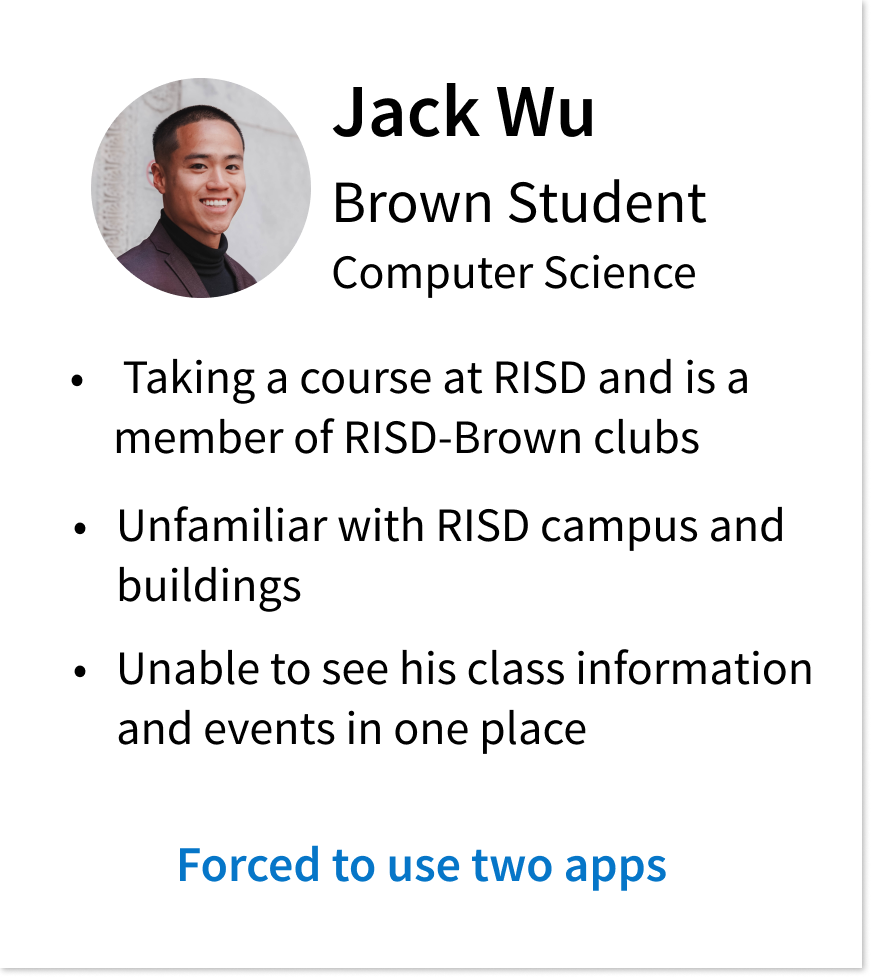
User Personas: Brown Student
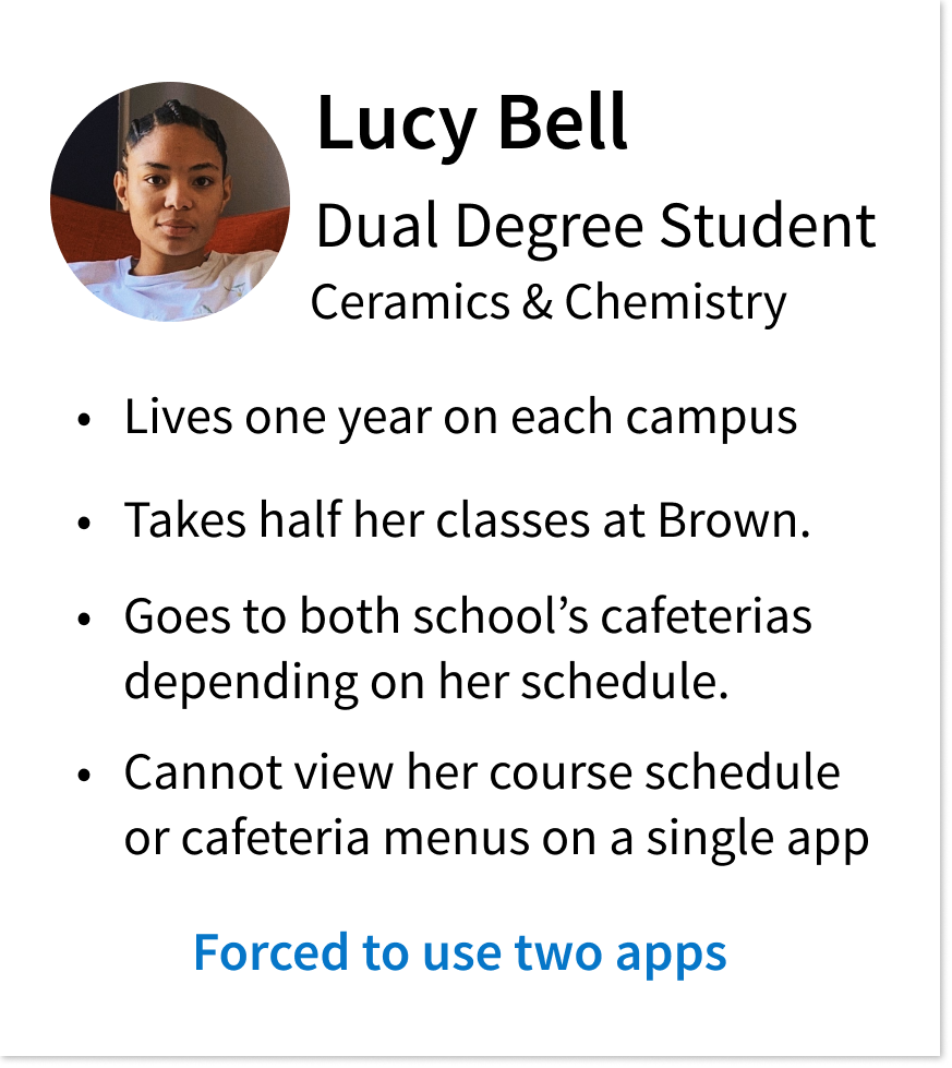
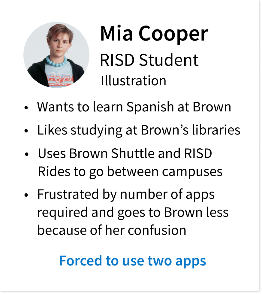
An integrated app where students can access information in one place was clearly required by all three student populations with different needs. Notably, I found that transportation was especially important, since that is the one resource that can be used by all three user populations.
Research Insights
Home Page
Across both apps, students found the amount of information to be overwhelming. Students typically used only a few offered features like laundry and dining.
However, individuals had different, and even contradictory opinions on what features they felt were necessary.
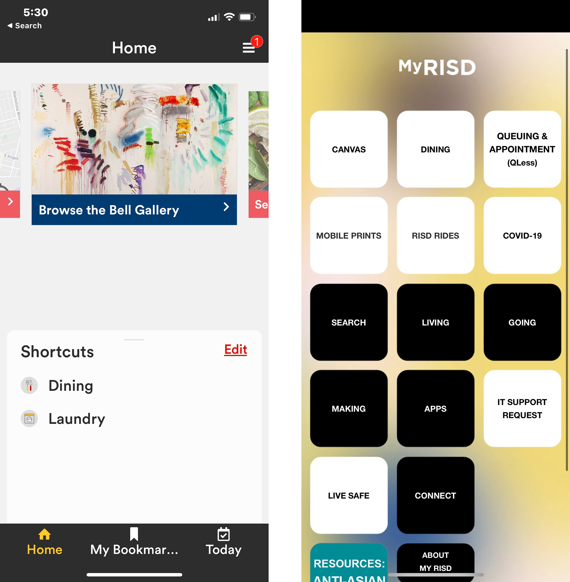
Home Screens of BrownU and RISD app
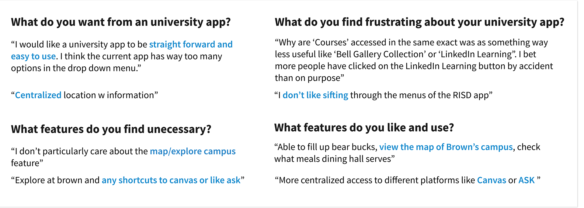
Students don't have what they need on the main menu, the appearance was deterring usage, and there was frustration over what features existed. My research suggested the importance of the app being customizable, with an individual's students most used features being most easily accessible.
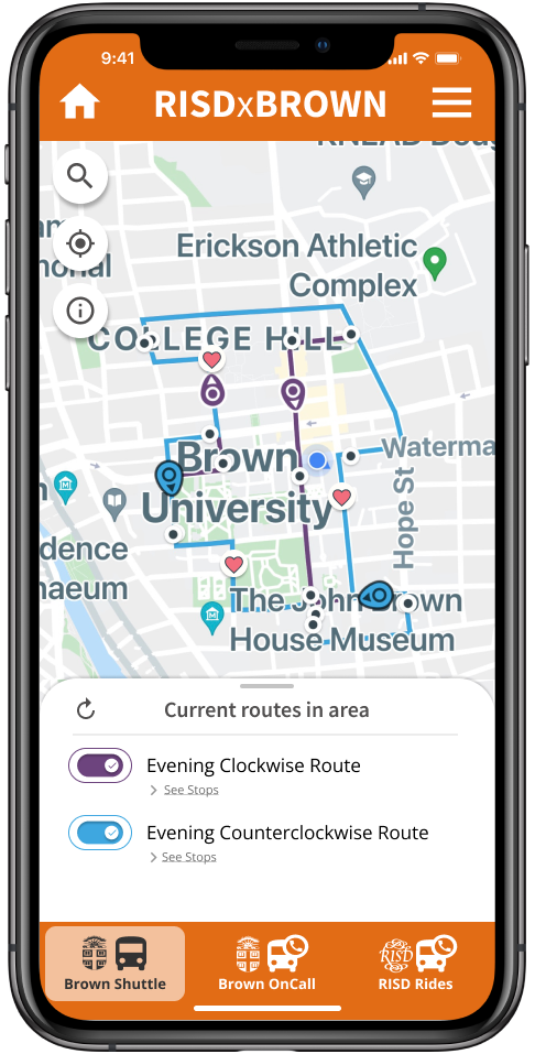
Transportation
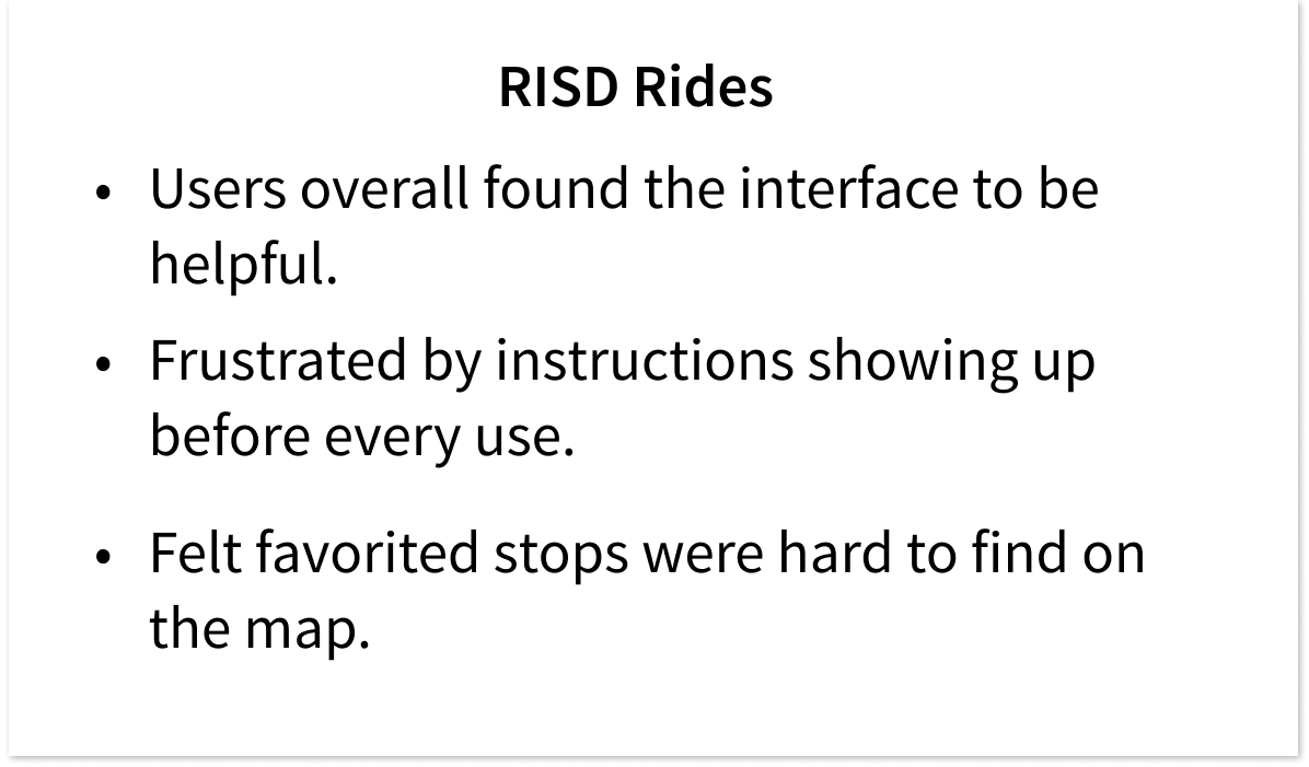

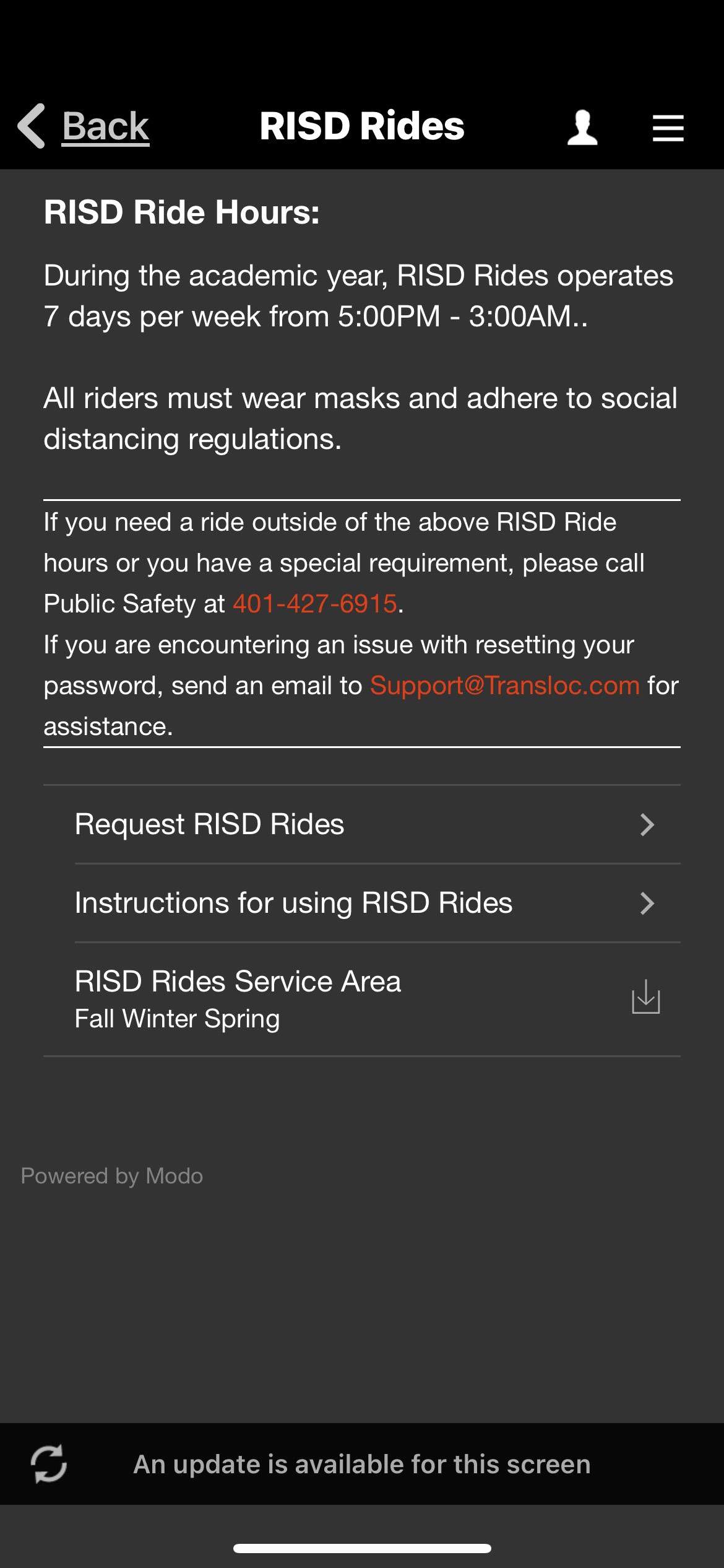
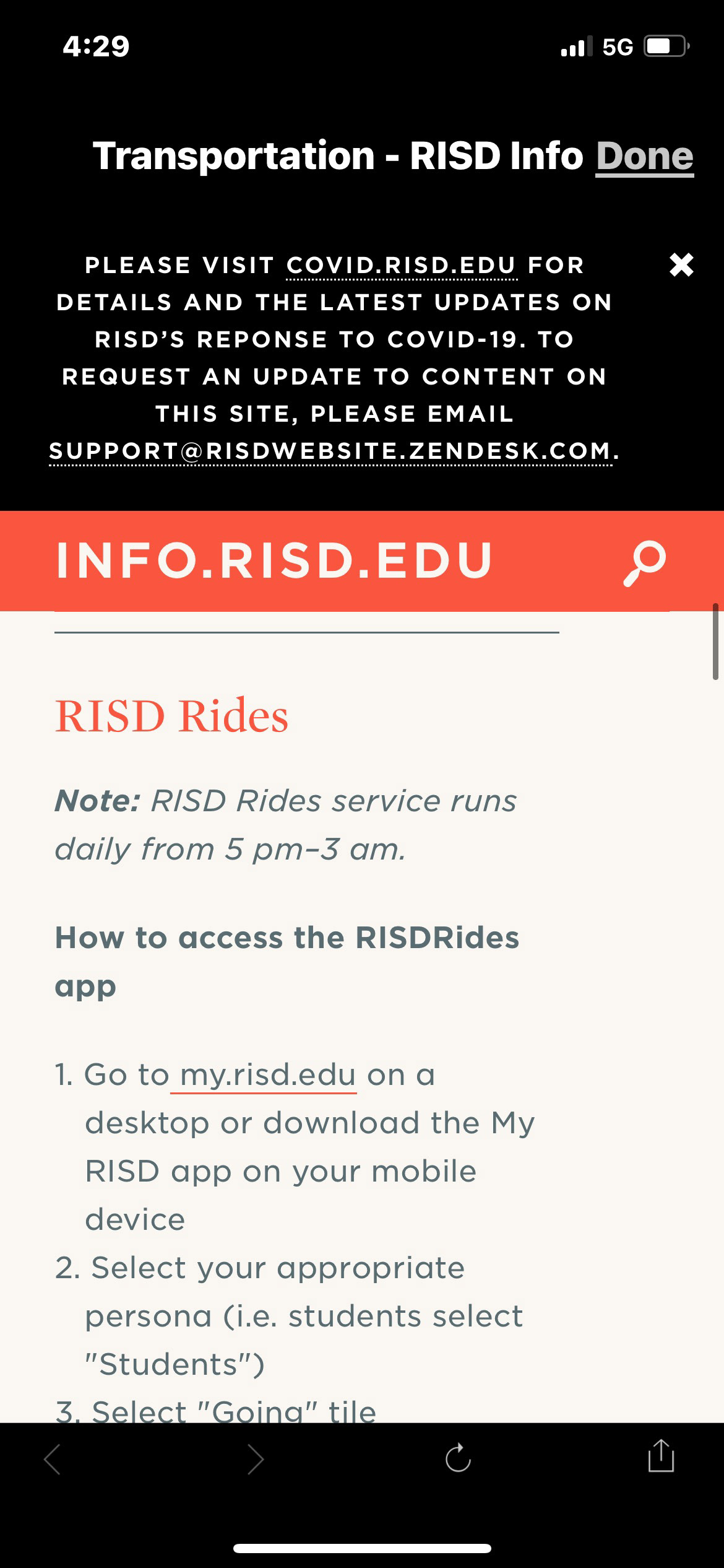
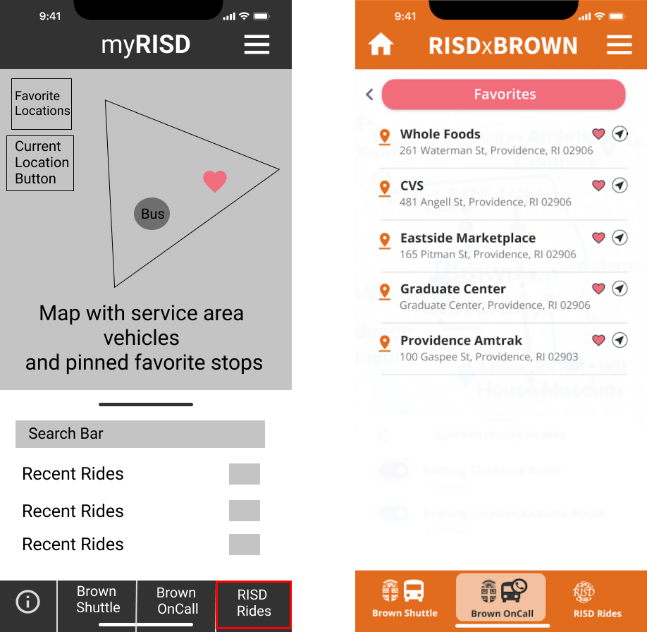
RISD RIdes - Home
RISD Rides - Map
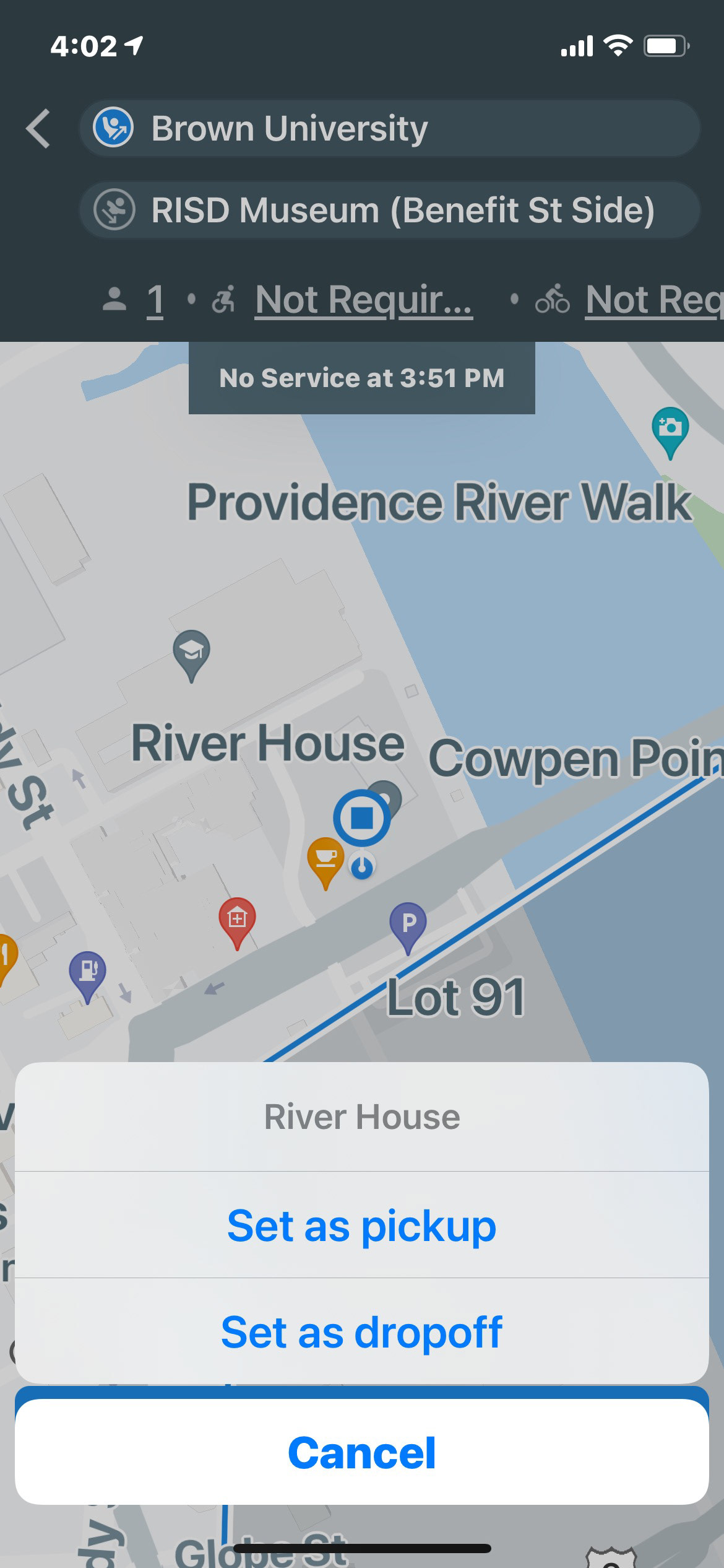
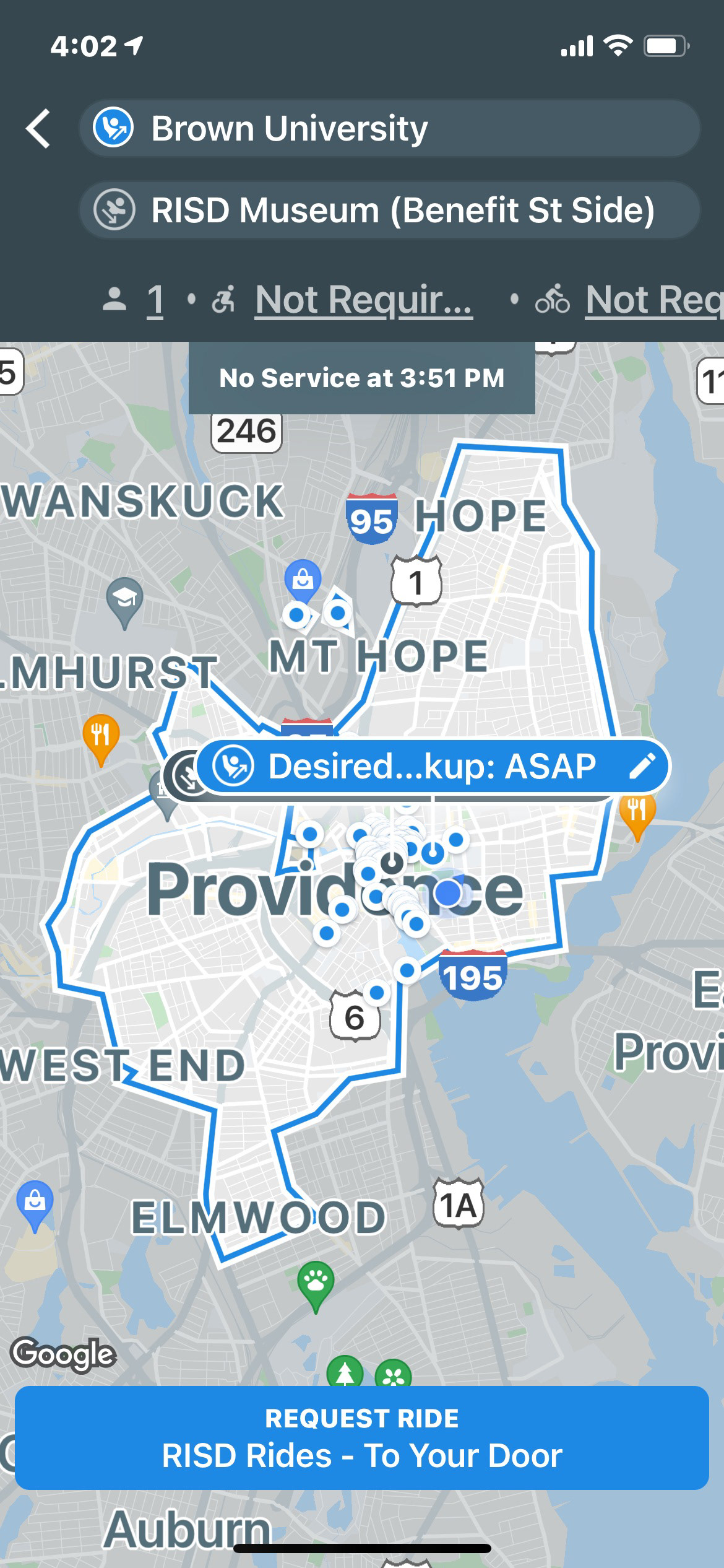
RISD Rides - Select Location
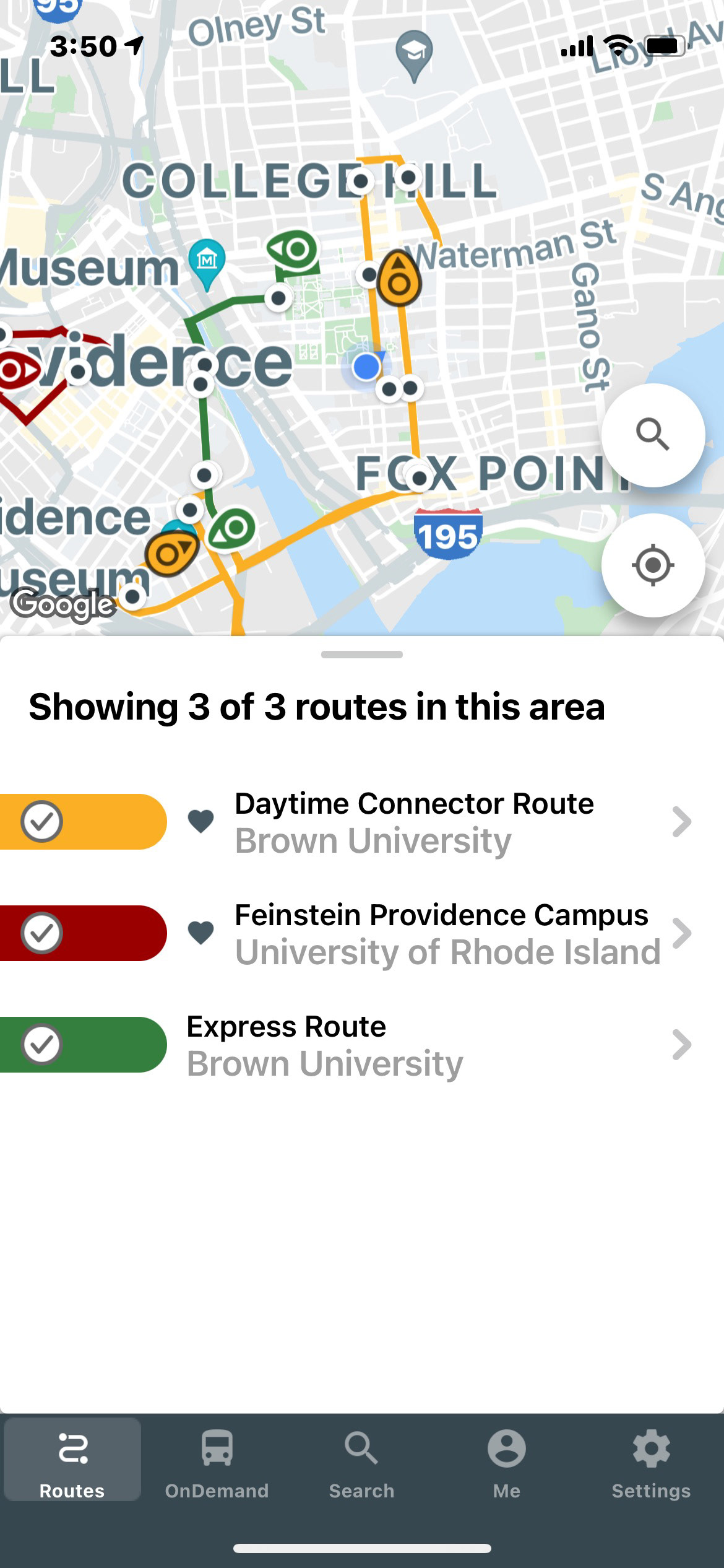
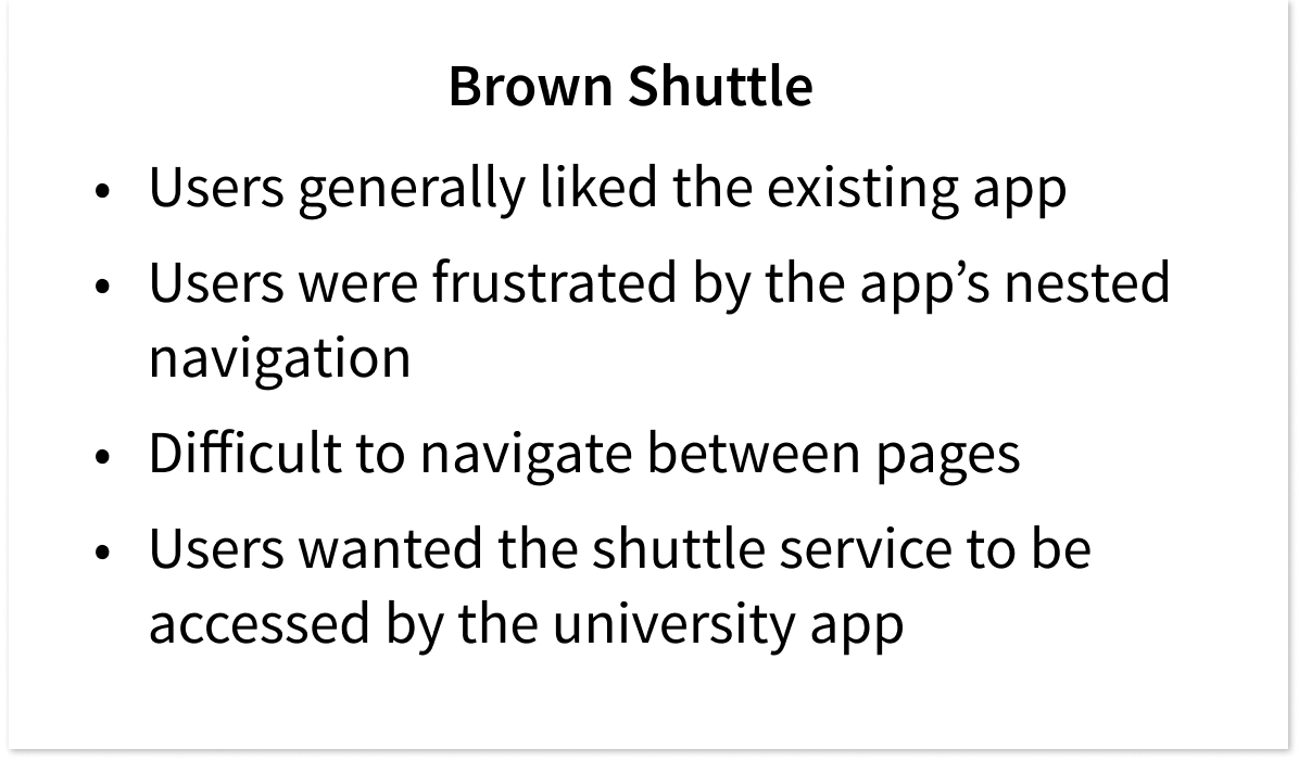
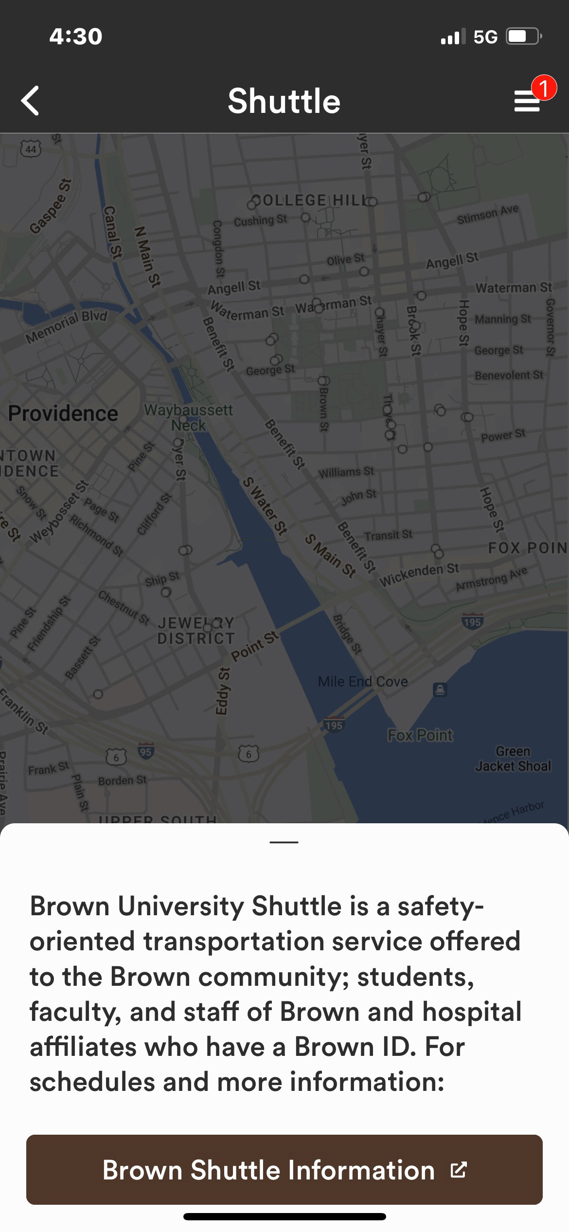
Brown Shuttle App - Home
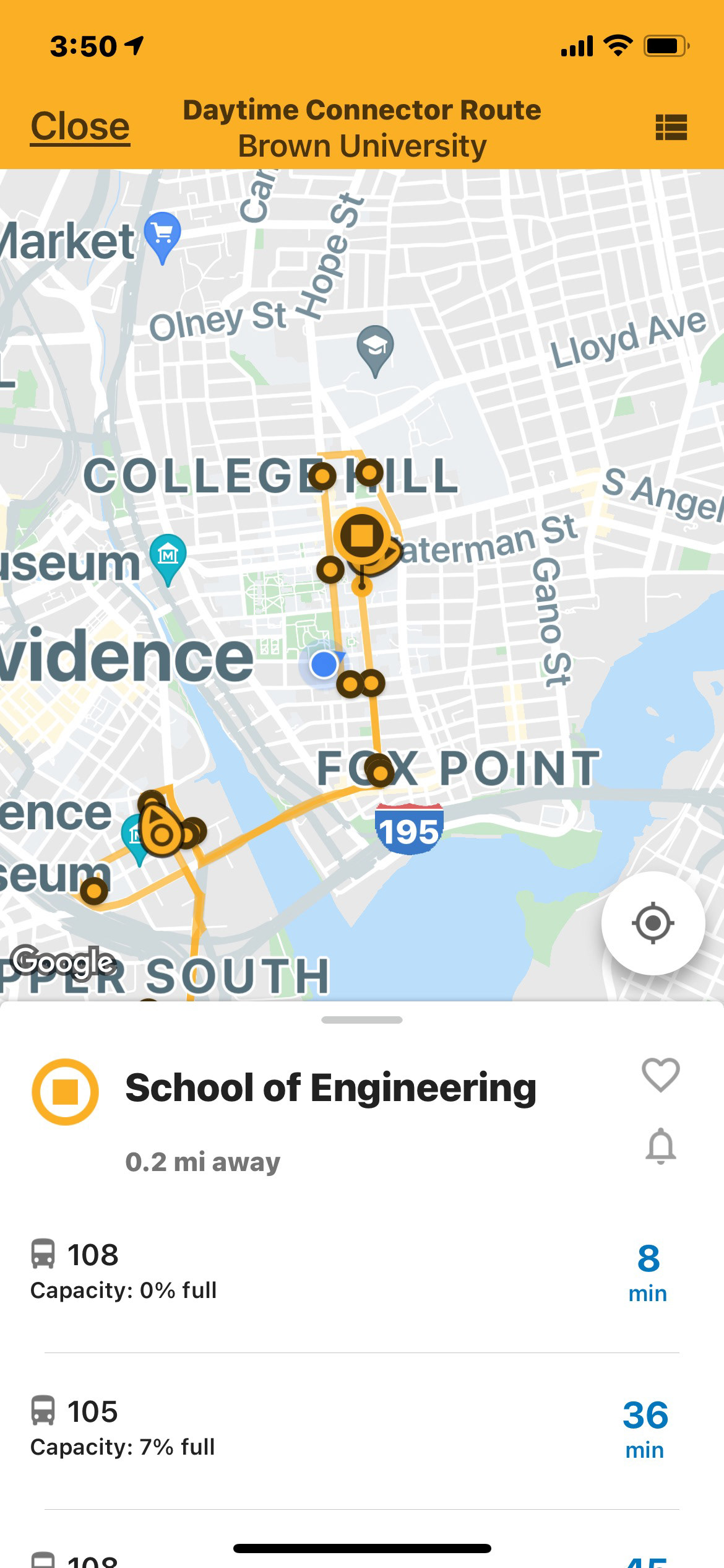
Brown Shuttle App - Stop
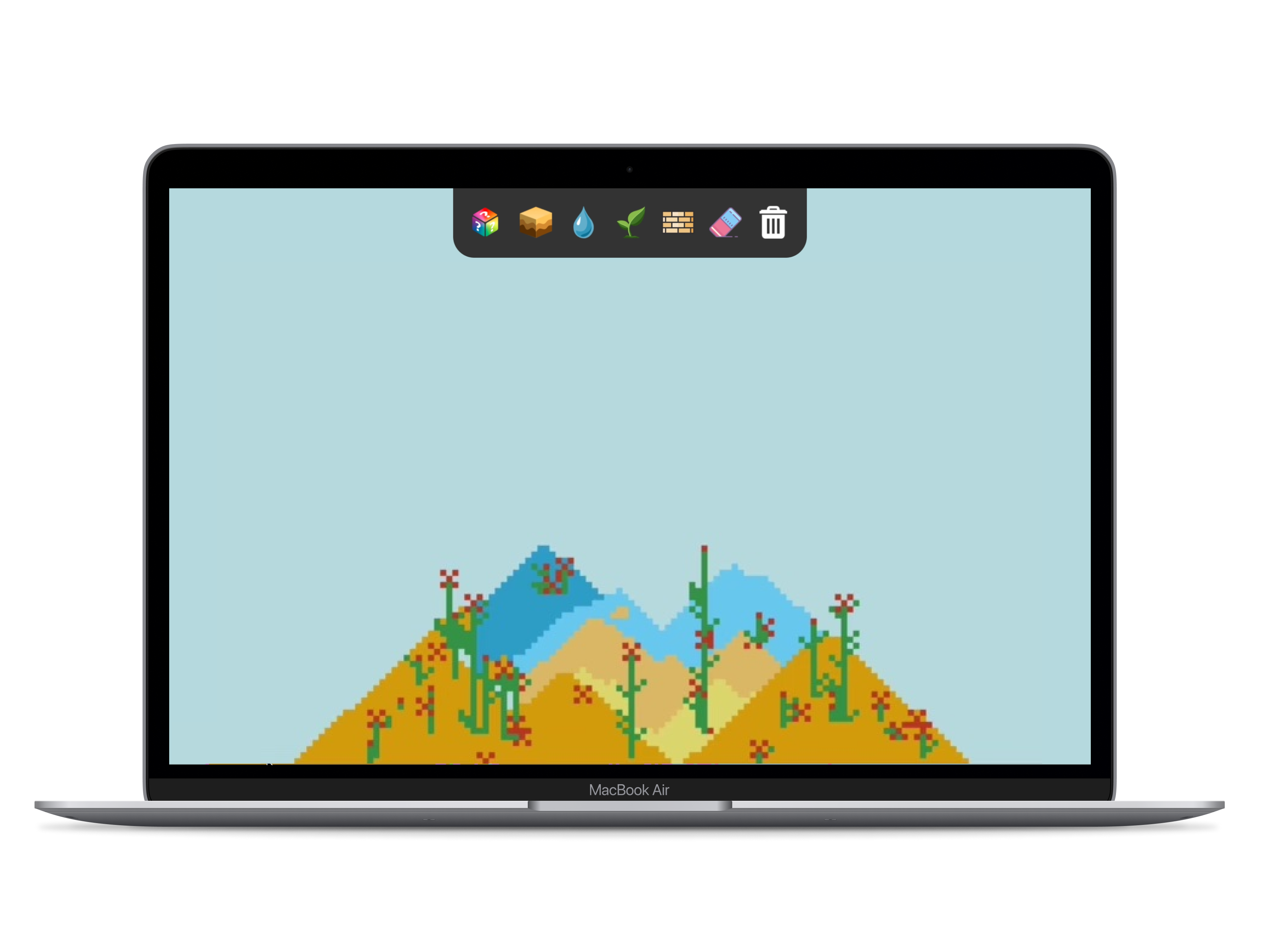
Currently, figuring out transportation creates more effort than simply not traveling, and my main goal was to fix this issue.
I aimed to make all three services accessible from the same page so that they were stored in a centralized location. Based on my research, the basic structure of the existing two apps were well-liked, so I decided to keep the general framework while improving the user flow and certain features of each service.
Design Iterations
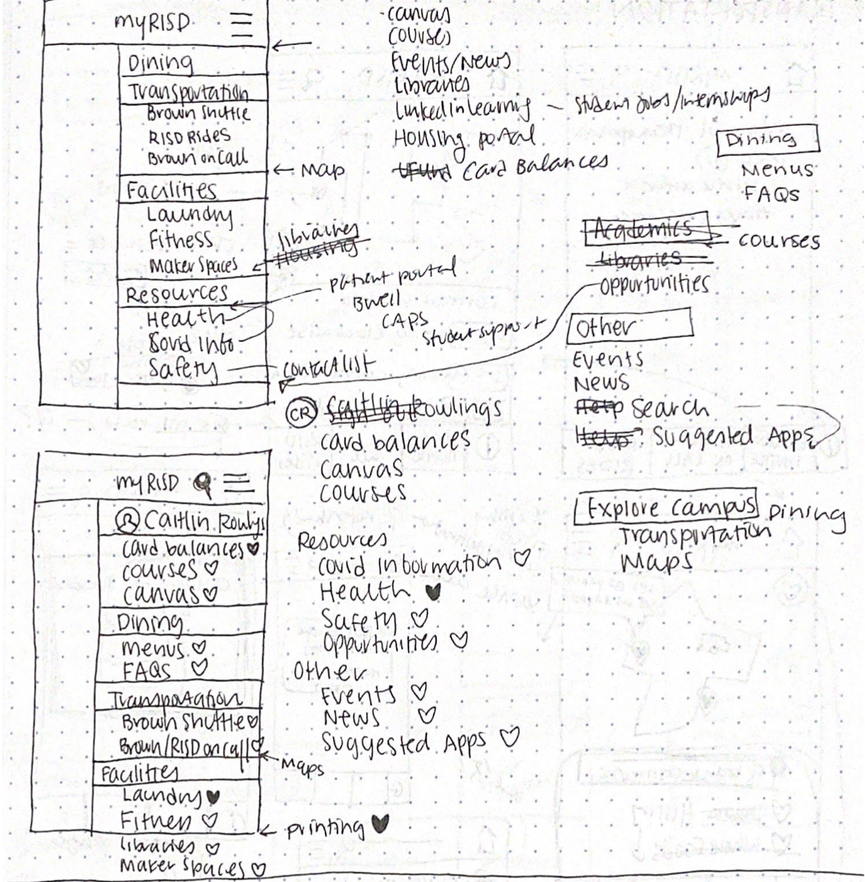
Home Page
I wrote a cohesive list of the links and pages offered by both apps, before deciding which were more important, and dividing them by categories.
Transportation: Overview
I made it so getting information about the services does not redirect you to the Brown or RISD website, but instead it is all on one page.

Brown Shuttle
Instead of taking you to a separate page, I designed the shuttle stops to be clickable on the map so you can quickly see relevant information.
Brown OnCall & RISD Rides
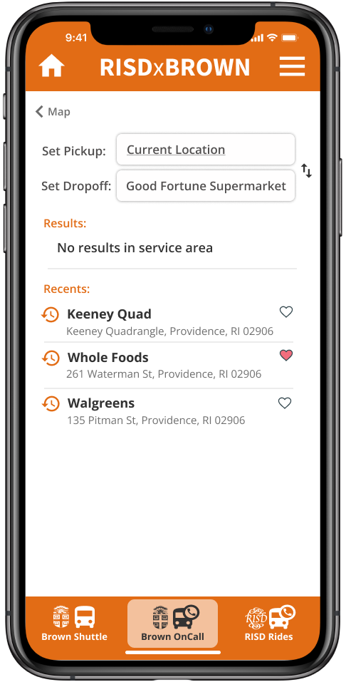
I designed these two services to have the exact same interface with individualized instructions and service areas.
I made recent rides immediately viewable from the main screen so students can more quickly select their routine destinations.
I also added favorite locations to the map and their own page such that these locations can be selected via map or list view for ease of use.
Initial Wireframes
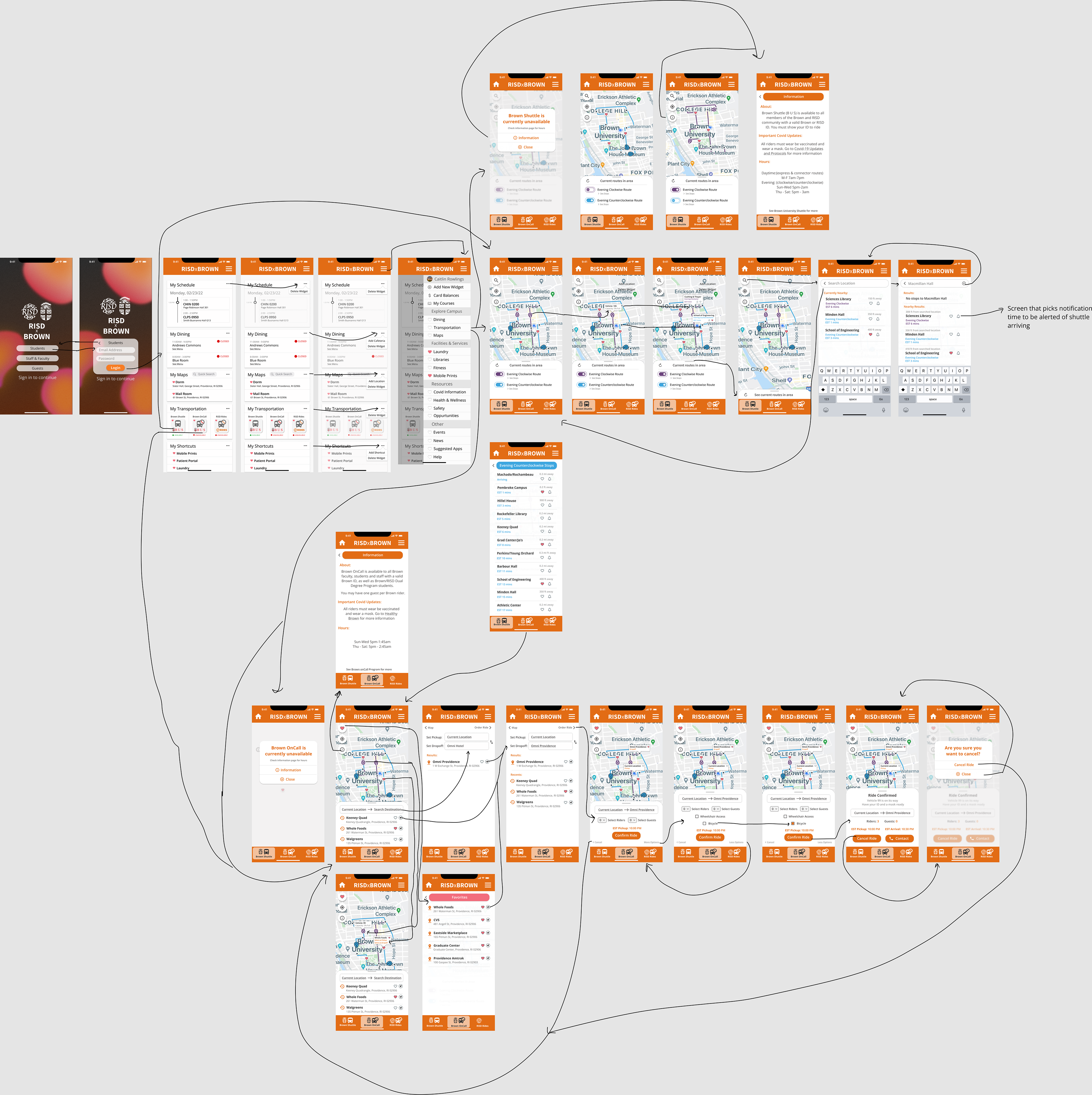
User Testing & Validation
After creating a low and high fidelity initial wireframe of the app, I conducted 3 validation interviews in order to further improve the app.
Potential users appreciated the depth and customizability of the app. However, I received feedback to make certain features such as vehicle capacity more visual. Additionally, certain buttons were unnecessary while other plain text headers appeared clickable.
Final Design: Streamlining & Simplifying
Moving forward, my goal was to make my design more straightforward while thoroughly addressing what the users needed. I attempted to convey a huge range of information, so making my design as clean and easy to follow as possible was very important for users to efficiently navigate the app. Below this section are my highlighted features and changes.
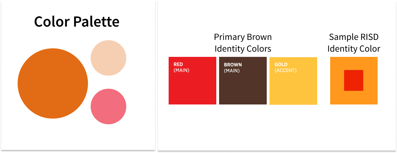
Style Guide
My design reflects both Brown and RISD’s existing identities. I chose fonts that mimicked existing Brown and RISD typography. I also chose an orange color that was close to Brown’s warm toned school colors and between the red, brown, and gold, while remaining consistent with RISD’s identity palette which uses “strong, bold, rich” and "vibrant" colors.

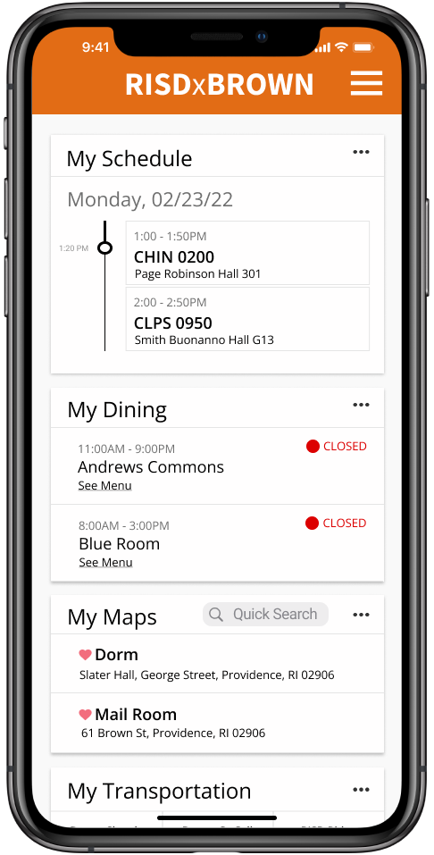
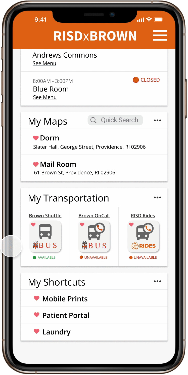
Home: Widgets & Navigation
Most users want quick information about what they care about. Widgets allow for easy and efficient access to what is important to a user. These widgets are customizable and can be moved by the user.
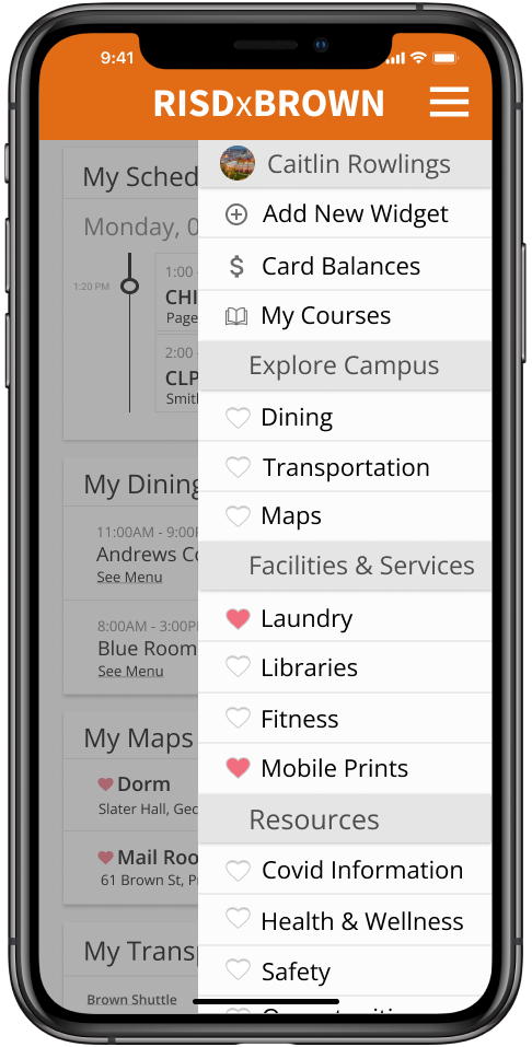
If a user is using the app to search for some information, they are expecting and willing to expend greater effort. Because of user expectations, navigation does not need to be immediately available on the home page. The categorized side bar will also make searching less overwhelming.
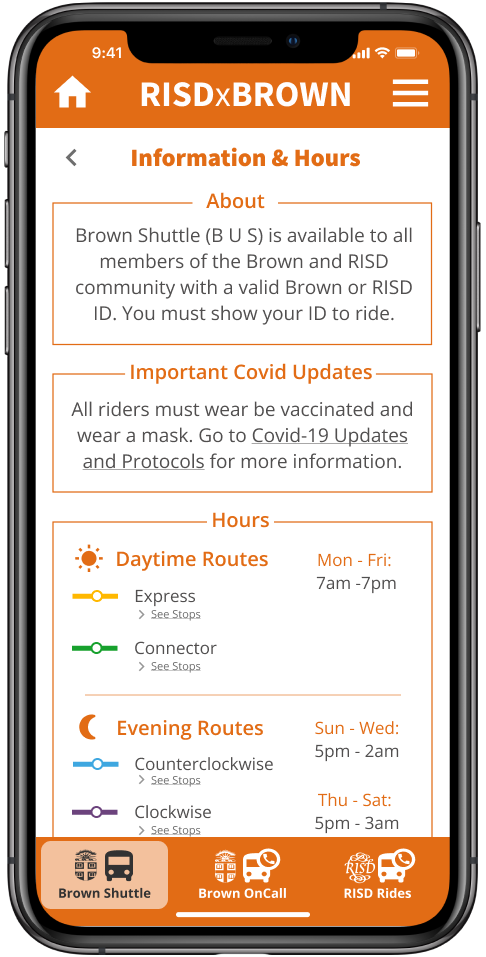
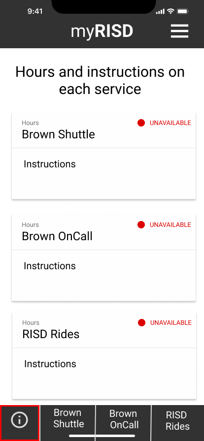
Transportation Information
Those who want instructions are willing to spend the effort to look for it, so I decided to create a separate information button on each service’s page. This way, returning users don't have to see instructions every time they open transportation.
I made sure it was clear and concise, so users don’t need to visit an external website for the information they need.
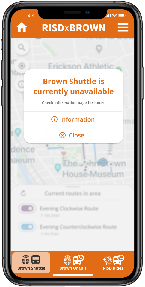
Transportation Availability
Users can only use the transportation services when they are available, and I wanted to decrease time wasted looking for the hours, or checking the services when they could not even be used.
To solve this, I made the transportation widget display availability, as well as add a popup before users could enter unavailable services.
Brown Shuttle
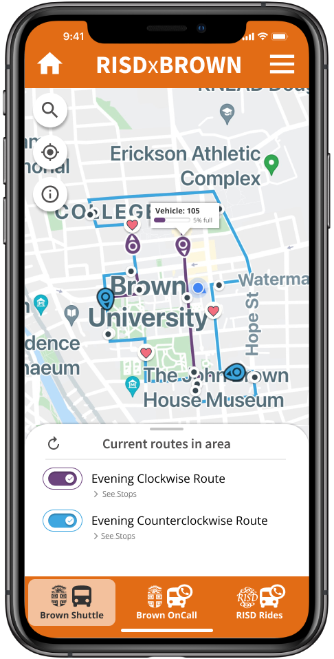

○ Colored capacity bar makes information more visual.
○ Stops are clickable from the map, so it is easy to access relevant information and favorite or add alerts, simplifying user navigation.
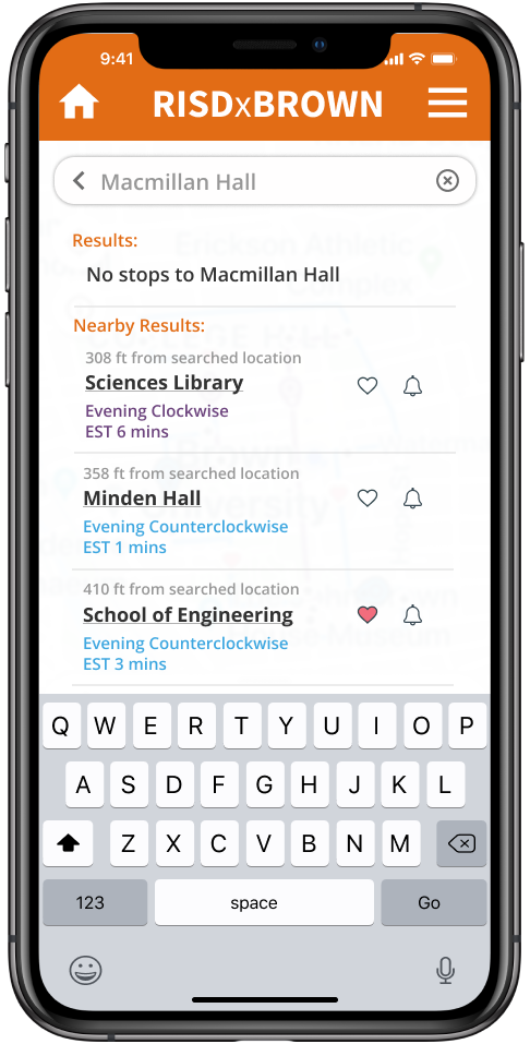
○ Search returns the stops associated with that location, or the nearest stops, so users know where to go.
Brown OnCall & RISD Rides
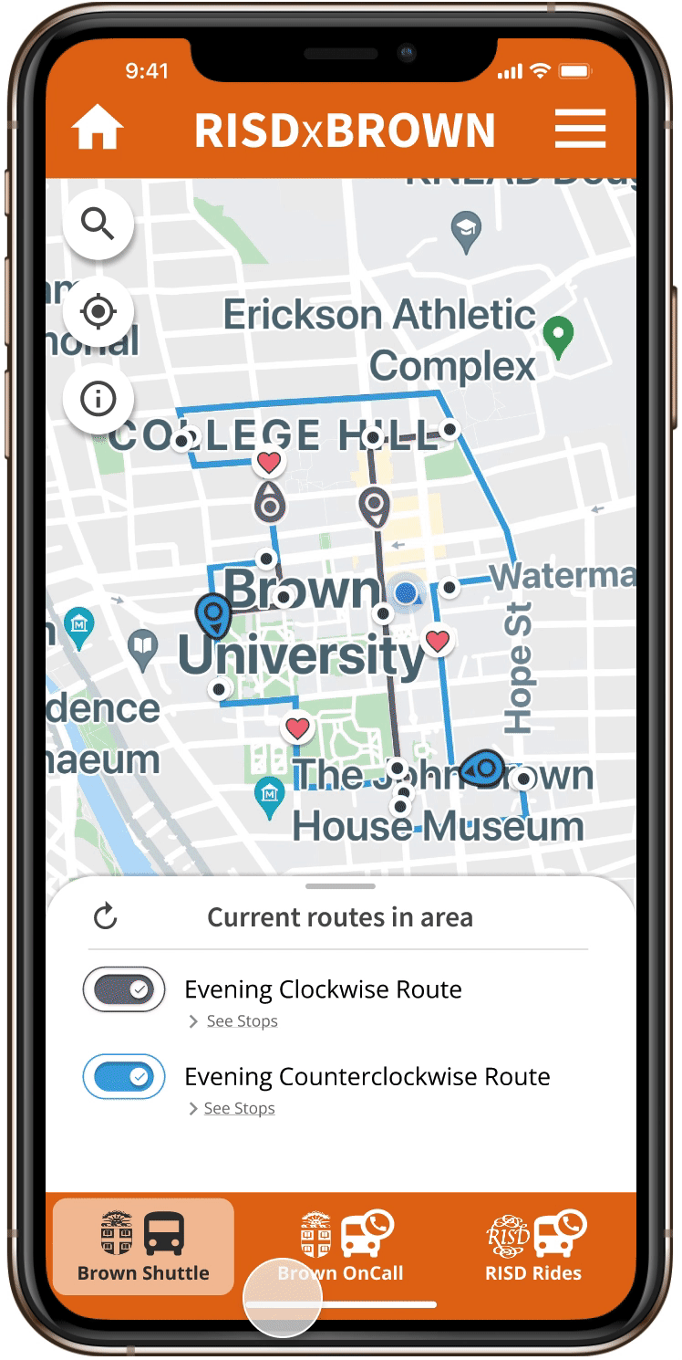
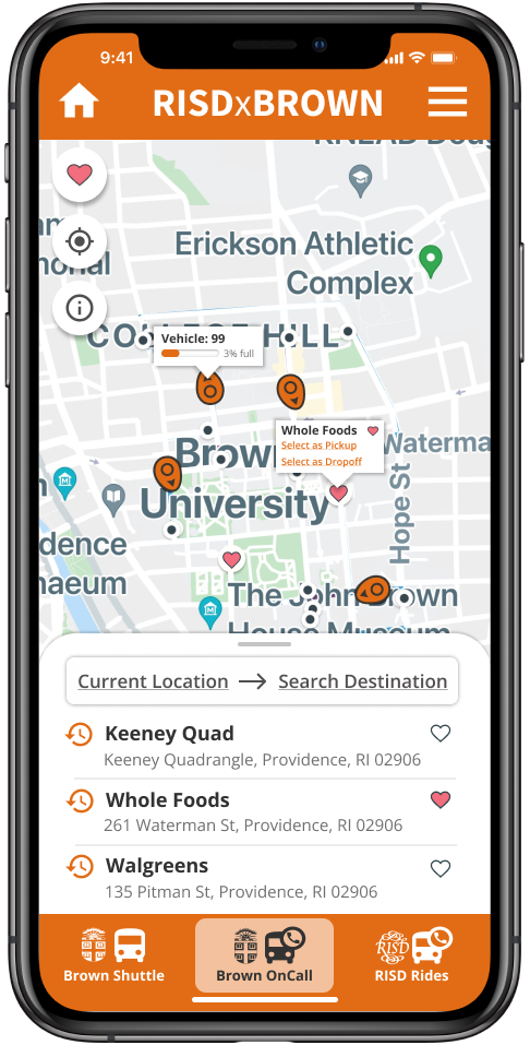

○ University locations, vehicles, and favorite locations are visible and clickable on the map.
○ Stops can be selected from the map, search, recents, or the favorites list so users can more easily order a ride.
○ Search informs users if the desired location is out of the service area to minimize confusion.
○ Upcoming stops allow users to stay updated on their ride since time estimates are often inaccurate due to the constant changes.
Final Wireframe & Prototype
Next Steps
○ Create more widgets, or a widget library for the home screen
○ Add scheduled rides for OnCall and RISD Rides
○ Redesign transportation service logos to be more unique
○ Design the app for different personas (Brown vs Dual Degree vs RISD student)
Reflections
This was my first large scope design project and I gained invaluable experience working through a full iterative design process from user research to final design implementation. I had often had frustrations regarding the Brown University and Shuttle app, and appreciated the opportunity to redesign something that directly impacts me.
This project highlighted the numerous details that go into a single mobile app screen. I learned that the design process is iterative one that builds upon my initial ideas with feedback from others. I am excited to carry the skills I learned from this project onwards to think about how to improve my design for the user.